The Taxonomy team (Jeffrey Aronson, Douglas Badenoch, Jon Brassey, Iain Chalmers, Claire Friedemann Smith, and David Nunan) update us on progress.
What has been happening?
The last time we blogged we were grappling with how to organize 49 (now more) entries in the Catalogue of Bias into a system that is informative and easy to use. No small task. Now, a dendrogram, sunburst chart, and illegible timeline later, we have settled on a spider diagram with an accompanying interactive table – the Big Table o’ Bias, which we hope will meet the needs of most visitors to the Catalogue.
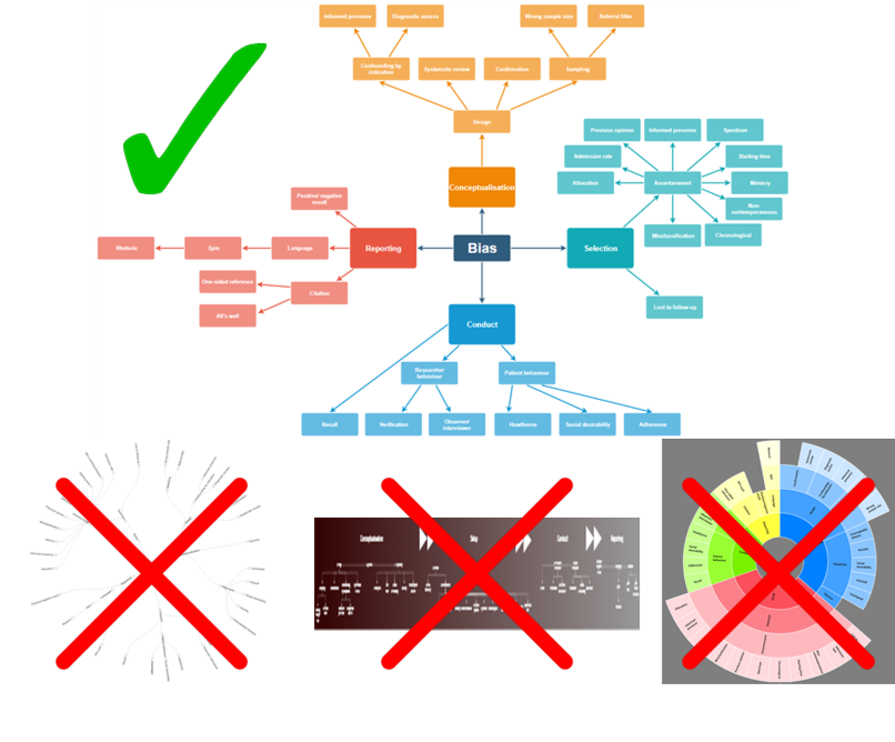
Ideas for Taxonomy visualisation
What have we created?
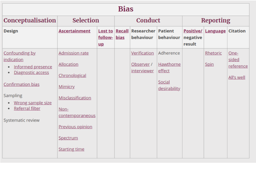
As we explained in our first blog, our aim with the taxonomy was to create a way of ordering and displaying the biases in the Catalogue so that they were easy to identify, whether you were experienced with research bias or completely new to it. We have designed our spider diagram so that study stage, rather than the names of individual biases, is the starting point for any visitor. The diagram also allows the user to see the relationships between the biases at each study stage. The Big Table o’ Bias similarly presents the biases grouped by study stage, with the interrelationships between top-level biases and “offspring” biases displayed in the table columns. Our plan is to provide the option to switch between “table view” and “diagram view”, so that users can choose whether they prefer a more visual or structured layout.
The “Big Table o’Bias”
What next?
Our aim is that the bias diagram and the Big Table o’ Bias should be as user-friendly and interactive as possible. A large, and growing, bias diagram is already difficult to fit on a normal size computer screen and will be impossible to read on the tablets and phones that visitors to the Catalogue may be using. With this in mind, we plan to pare down the diagram to its central structure and have the biases appear or enlarge when the user selects the study stage of interest. We shall also make sure that the diagram and table use the same colour scheme so that switching between them is as easy as possible. Finally, we need to develop clear terminology – for example, should the “Reporting” study stage be renamed “Dissemination” so as not to cause confusion between it and Reporting Bias?
As before, we shall be interested to hear your thoughts via Twitter on @Catalogofbias and #taxonomyofbias.